Pantone Color of the Year 2026: Using Color Intentionally
The Pantone Color of the Year 2026, in case you missed it, is Cloud Dancer (PANTONE 11-4201). It’s a soft, billowy shade of off-white and it’s already shaping how designers think about warmth, balance, and personality at home. At Xela Andrews Interiors, we see the Pantone Color of the Year 2026 as an invitation to use color more thoughtfully, not just more boldly! It’s a lovely creative starting point for building spaces that feel personal, functional, and beautifully considered.
As interior designers, our goal is never to chase trends for the sake of trends. Instead, we focus on how color can support the way you live, move, and feel in your home. And with the rise of layered 2026 color trends, this year is all about intention!
Why Pantone’s Color of the Year Matters
Pantone’s Color of the Year for 2026 sets the tone not just for interiors, but for fashion, lifestyle, and how we emotionally connect to our spaces. It often reflects what people are craving, whether that is comfort, grounding, creativity, or calm.
While the featured color usually steals the spotlight, its success in a home depends entirely on how it’s paired. Color never exists alone! White, neutrals, lighting, and materials determine whether a space feels elevated or overwhelming.
Think of the Color of the Year as inspiration, not a rule. It’s a guide for building cohesive, livable color palettes for home interiors, not a mandate to paint every wall the same shade!
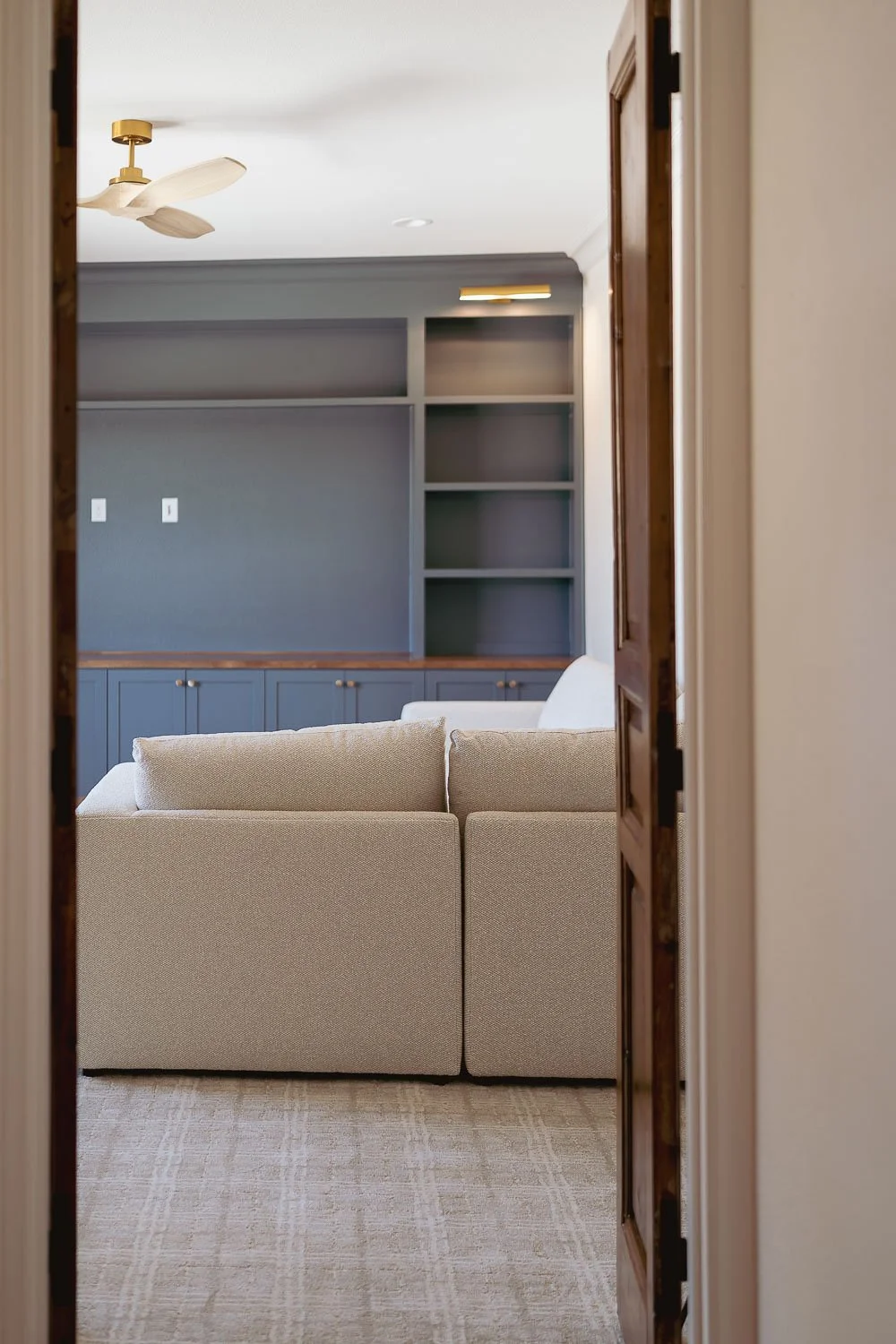
The Role of White: The Unsung Hero of Color
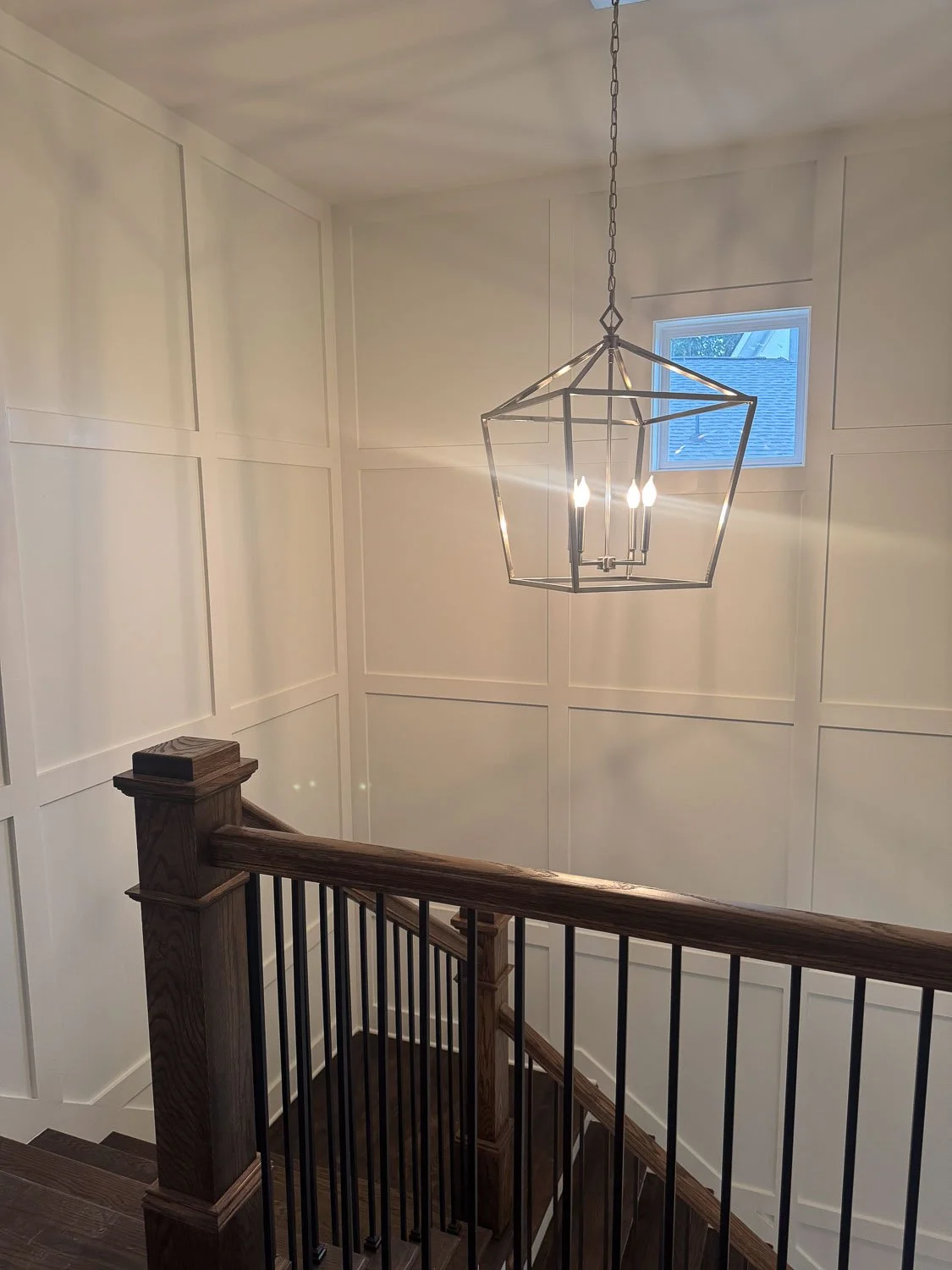
White is often treated as a default, but in reality, it is one of the most important design choices you can make! Every white has undertones, and those undertones impact every color they touch.
Why White Matters More Than You Think
Warm whites tend to enhance the earthy, organic tones we are seeing across many 2026 color trends. Cooler or stark whites can flatten richer colors or cause visual tension.
The right white can:
Enhance depth and richness
Create cohesion between rooms
Allow color to feel intentional and timeless
The wrong white can:
Make colors feel muddy or harsh
Create visual disconnect
Leave a space feeling unfinished
When clients feel like something is “off” in their home, white is often the missing piece.
Pairing Pantone’s 2026 Color with the Right White
Our advice is always the same. Choose the color first, then select a white that supports it. Testing both together in the actual space is essential since lighting changes everything!
Undertones in flooring, stone, and upholstery should always be considered when selecting white. Sheen matters too. Matte walls absorb color and feel softer, while satin or semi-gloss trim adds contrast without changing the color itself.
Also, consistency is key. Using too many whites in one space often creates visual noise instead of balance.
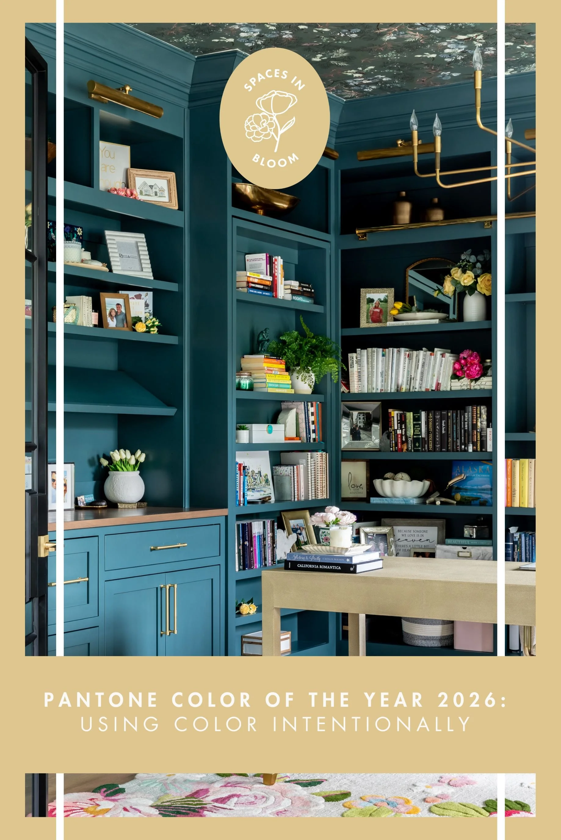
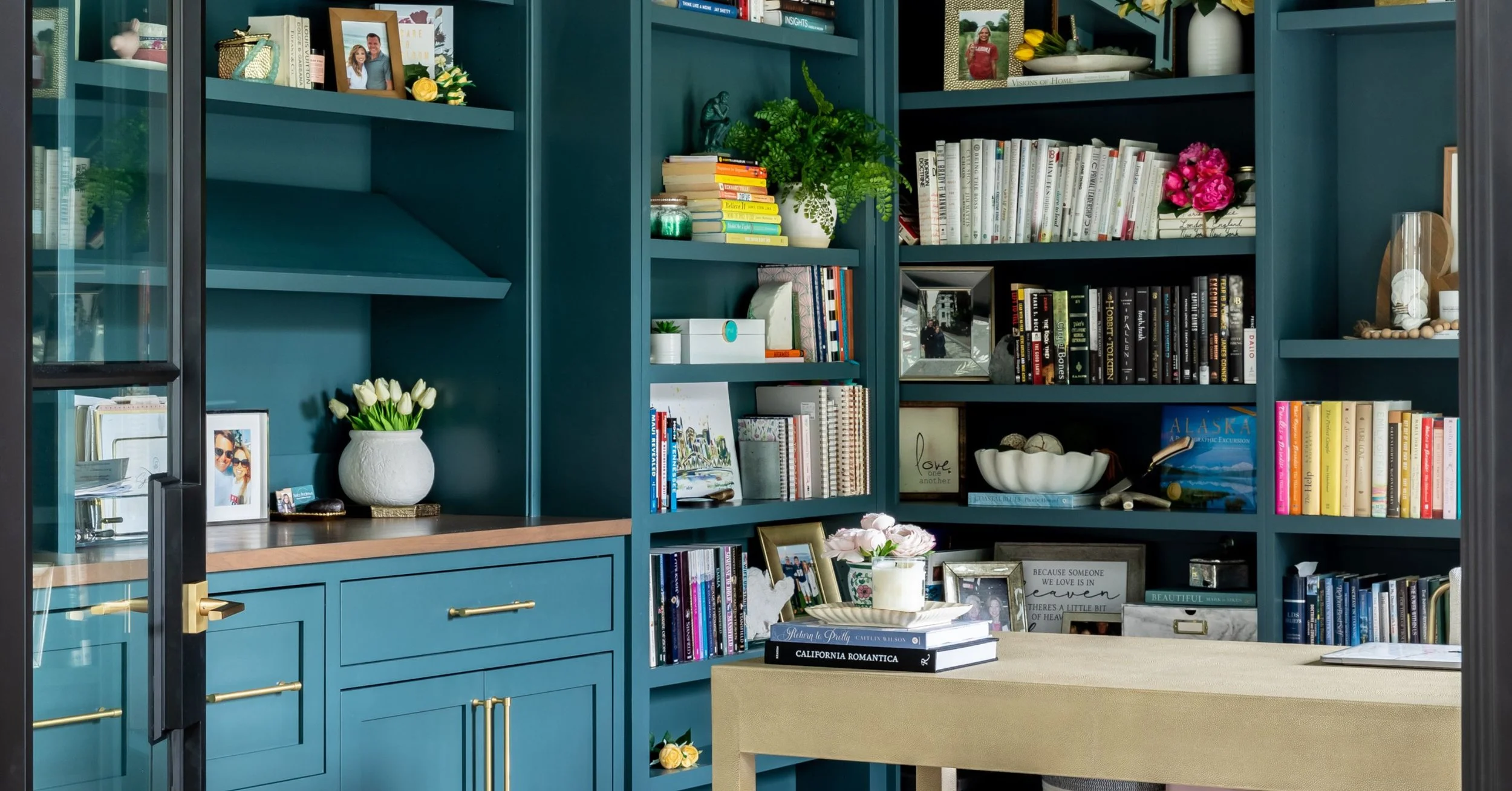
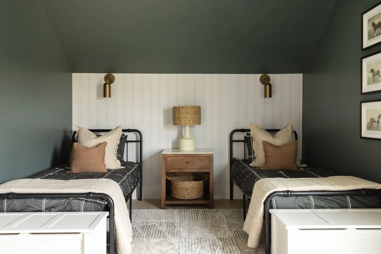
Color Drenching: A Bold Interpretation of the Trend
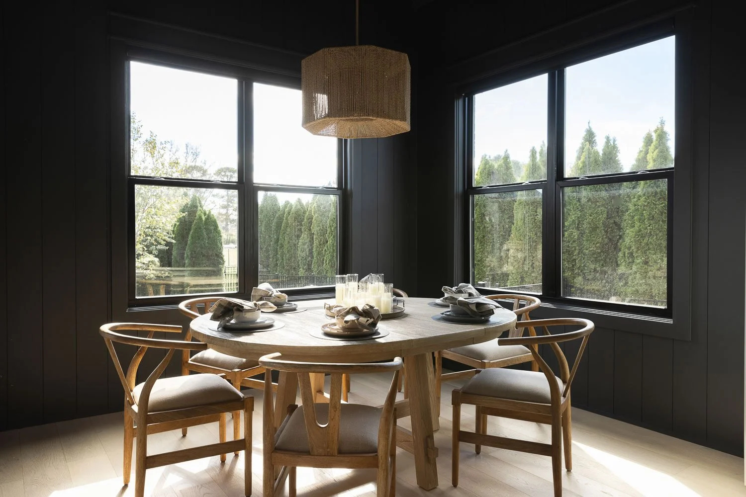
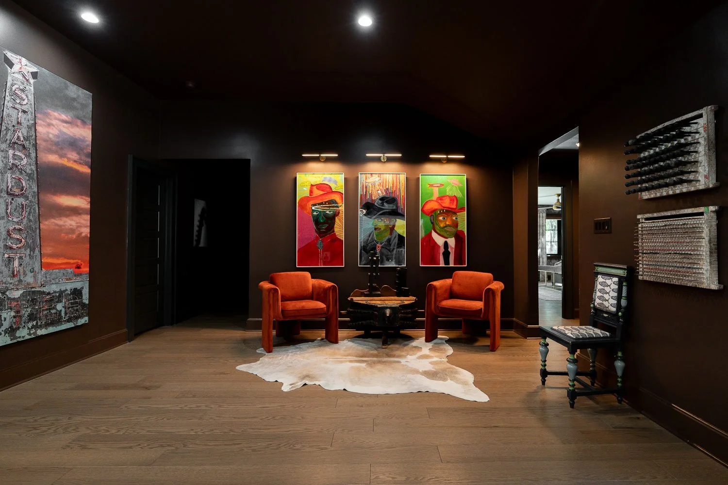
One of the bolder (and most talked-about) applications of the Pantone Color of the Year 2026 is color drenching.
What Is Color Drenching?
Color drenching means using one color across walls, trim, doors, and sometimes ceilings. The result is a fully immersive, cocoon-like effect that feels dramatic and intentional.
Where Color Drenching Works Best
Color drenching shines in:
Powder bathrooms
Bedrooms
Home offices
Deep, moody colors with richness and depth work best here. These spaces are meant to feel intimate and expressive.
Things to Consider
Color drenching works best with simple furnishings and minimal patterns. Lighting needs to be carefully planned, and this approach is not ideal for open-concept spaces or homes that need long-term flexibility.
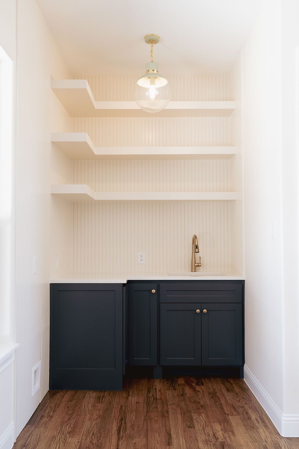
Color Capping: A More Livable, Layered Approach
We know color drenching is an exceptionally bold choice, so for clients who love color but want something more flexible, color capping is a favorite!
What Is Color Capping?
Color capping uses a different color or treatment on the ceiling to define a space while keeping the walls lighter or more neutral.
Why Color Capping Works
Color capping:
Adds interest without overwhelming the room
Keeps white involved as a grounding element
Feels layered, intentional, and timeless
It works beautifully in dining rooms, bedrooms, hallways, entryways, and rooms with architectural detail! It is a great way to incorporate 2026 color trends without fully committing every surface.
Wallpapered Ceilings: Color Capping Elevated
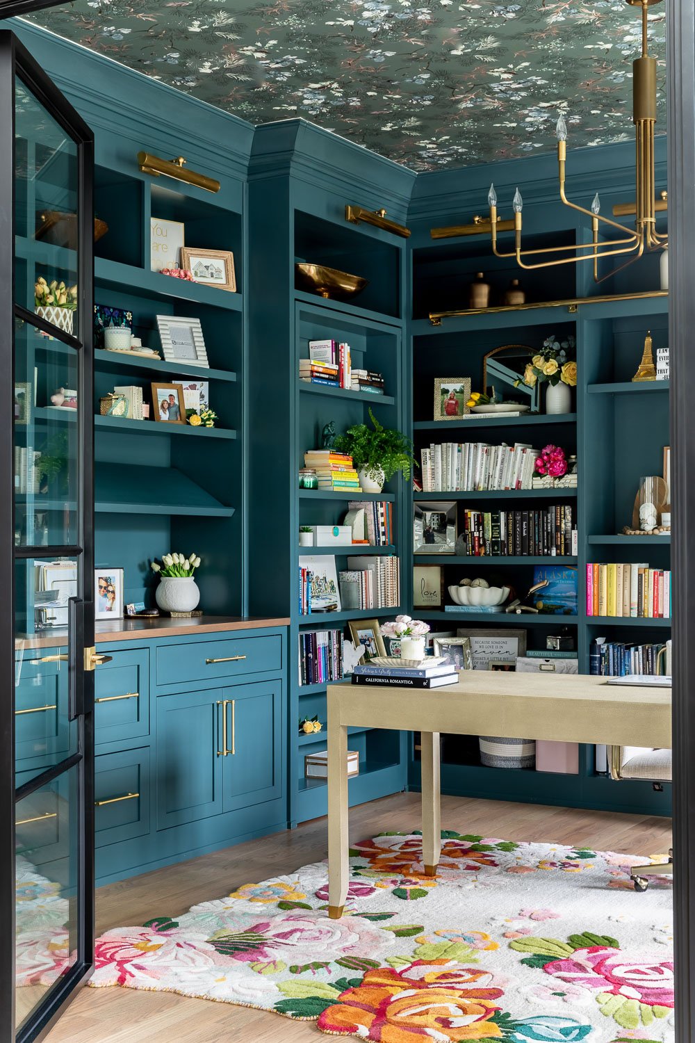
We love a wallpapered ceiling, and it truly takes color capping to the next level! Instead of paint, the ceiling becomes a patterned focal point that anchors the room. Wallpaper introduces color, texture, and movement without overpowering the walls.
Connecting Wallpapered Ceilings to Pantone’s Color of the Year
Wallpaper allows Pantone’s featured color to appear as part of a larger palette. The color might show up as a secondary tone in the pattern, a soft variation, or a complementary accent rather than the dominant hue.
Best Rooms for Wallpapered Ceilings
A wallpapered ceiling works especially well in:
Powder bathrooms where small spaces allow bold design
Dining rooms where drama enhances the experience
Bedrooms with soft, calming walls
Entryways and hallways that feel unexpected and welcoming
Home offices or libraries where personality matters
Tips for Using a Wallpapered Ceiling Successfully
Keep walls simple so the ceiling remains the focal point
Choose patterns with softer contrast and organic movement
Let the ceiling guide the wall color, not the other way around
Use a thoughtfully chosen white on the trim to ground the space
Pay attention to pattern scale since patterns that are too small can feel busy overhead
Lighting Is Key
Lighting plays a critical role when working with ceiling treatments. Wallpapered ceilings interact directly with light, so minimal, well-placed lighting works best.
Statement fixtures should complement the pattern, not compete with it! Warm lighting helps keep the ceiling from feeling overwhelming and maintains a sense of calm and cohesion.
Using Color with Intention
Pantone’s Color of the Year is most successful when it’s used with intention. Thoughtful white selection and layered applications like color drenching, color capping, and wallpapered ceilings help color feel timeless rather than trendy.
As Nashville interior designers and interior designers in Texas, we help clients translate the Pantone Color of the Year 2026 and broader 2026 color trends into homes that feel beautiful, functional, and deeply personal.
If you’re ready to explore color palettes for home interiors in a way that truly supports how you live, Xela Andrews Interiors would love to help! Reach out today to start designing a space where color works intentionally and effortlessly for you.
Like this post? Share it to Pinterest!